I have come to the sad realization that I lack all common sense and sensibility (you’re welcome, Jane Austen fans) when it comes to graphic design.
As a writer, I’ve always worked closely with graphic designers. Shout-out to Deb at CenturyCo, Chris at Ye Olde Publishing Company, and others over the years. Writers and designers, much like clownfish and anemones, have a symbiotic relationship, working together for a common goal. Put simply: they supply the artwork, I provide the words, we mash those together, and voila! Instant work of art. Or at the very least, serviceable marketing piece. We may be selling a product or service, advertising an event, or sharing information. Regardless of the intent, we rely on one another’s expertise to craft the finished product.
The key word being “expertise.”
I’m great with grammar, a superb speller, excel at editing, and ace alliteration. I can conjugate a verb like nobody’s business, and I’ll take a hatchet to your comma splice so quickly it’ll make your head spin. But I have zero knowledge of design elements.
Case in point: my marketing team at CenturyCo is launching a brand journalism site in January, and our designer is currently hard at work on a logo. During a recent meeting, I was embarrassed to find that the sample designs I liked best were the ones the rest of the group despised.
“Hey, that’s an awesome pen-through-the-x!” I said today. It looked something like this, but more modern.
Everybody else hated it.
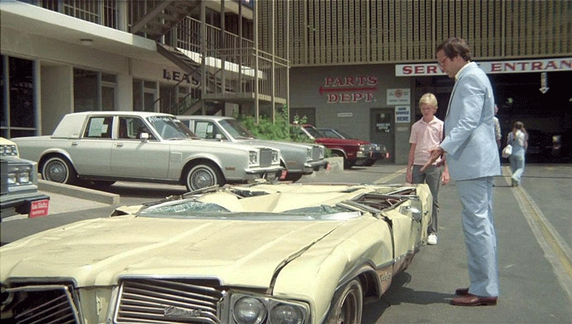
This happens every time we discuss logos and layouts, I swear. I always give the “wrong answer”…a pretty impressive feat given there are supposedly no right or wrong answers, ha. I’m like that contestant on Let’s Make a Deal who trades in $5,000 cash for what’s behind door number two, which turns out to be a brand new car!!…but one that happens to be crushed as flat as Clark Griswold’s trade-in in National Lampoon’s Vacation.
They’ll be talking about going with a serif font versus a sans serif, and it’s like I’m suddenly reading Lorem Ipsum because nothing makes sense. I have no idea what a “serif” even is! All I know is, one of them has a tail or a curlicue doohickey and the other does not, but I can never keep the two straight. I’m also pretty sure that neither “tail” nor “curlicue doohickey” is the proper terminology.
This is why, as much as I enjoy working with designers, I feel it’s best we stay in our own lanes. Otherwise, I’m liable to be all gung-ho over that Comic Sans script everybody else (rightfully) despises, and life is too short for the kind of ridicule that would follow such an admission, y’know?


Leave a comment